We released the Queensland Women’s Strategy 2022–27 [PDF 3883.96 KB] in March 2023.
As part of our commitment to women and girls, we engaged local artist and graphic designer Casey Coolwell-Fisher to develop our strategy’s signature artwork.
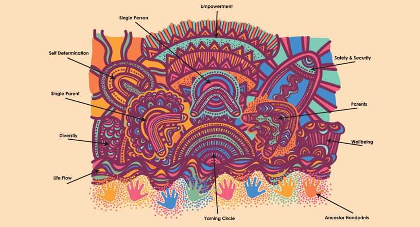
What it shows
Casey explains that her artwork shows how everyone lives in different ways. They have different support systems and achieve goals differently. The artwork also shows different stories from different living groups who are having a yarn and discussing life.
What each part means
People and groups
The centre of the artwork has 3 main parts that show different groups of people:
- single parents with children and a big community and family support system
- single people creating their own footprints
- parents with children, sharing their stories and creating their own.
Casey uses boomerangs to represent these groups because they show:
- strength through their structure
- power through their ability to return
- technique through hunting and gathering
- diversity.
Conversations
The semicircle in the centre shows a yarning circle. It’s holding conversations through the line work and creating footprints through the dots.
In the background are 5 different sections that show the yarning circle’s conversations.
Diversity
The curved parts in this section show different cells mixing and creating diversity among one another.
Self determination
In the centre of this part of the artwork is a ‘u’ shape that shows a person. The tiny dots are footprints that expand out through the outer curved lines. This speaks to the strength of one’s being, expanding out into the world.
Empowerment
The triangles in this section show goals or stepping stones that are moving upwards. The lines are the tracks people make. The dots are the people helping and supporting us.
Safety and security
This section represents the safety and security we all need. The centre part shows a shield that offers security and safety in all situations.
Wellbeing
This section stands for our health and wellbeing. The outer ‘u’ shaped parts show the mental and physical aspects of one’s self. The lines mean connection, working and learning from one another.
Our past, present and future
The wavy lines on the bottom of the artwork show the flow of our lives. Nothing is in a straight line because we all have our ups and downs.
The handprints are that of our ancestors. They’re helping us in our ‘walking lives’ to achieve our goals and create knowledge for future generations.
[Music]
Hi, I’m Casey Coolwell-Fisher and I’m a Quandamooka Nunukul woman from Minjerribah North Stradbroke Island.
[Music]
I'm a graphic designer. Creating graphic design pieces allows me to explore who we are as people and also tell our stories from where our mob's from and then relay it into the way that we see it now.
So when I was younger my mum she loved to paint as well. But because we were from the Stolen Generations, that had been taken from us. So then having us go back to Country on Minjerribah and see the different elements that I can draw into my artwork is truly amazing. My artwork has learned from spiritual feelings. And also when I go to sleep, they all just come to me and I have to get up sometimes to just get it out there. And I feel that's from my ancestors telling me how to do it and what to do.
Being selected by Queensland Women to create different ways the art piece is truly amazing as it draws people in and allows people to see different ways that women of Queensland live. And it also changes legislation within Queensland, which is truly amazing.
So when I first started creating the piece it was just a black and white piece and I brought that into Queensland Women and they loved the piece, which is great. And then that's when all the colours and all the small pieces come into place.
Everyone lives differently, have different support systems, and achieve goals differently. This artwork consists of different stories from different living groups having a yarn and discussing life.
The three main centrepiece elements consist of three different demographic groups. Single parents, single persons, and parents with children. The groups are represented in the boomerangs to signify strength (structure), power (returning abilities), technique (hunting and gathering), and diversity (several uses).
The semicircle in the centre represents a yarning circle that is holding all the conversations through the line work and creating footprints through the dots.
The background has five different sections representing the yarning circle’s conversations of diversity, self-determination, empowerment, safety and security, and wellbeing.
The wavy lines on the bottom of the artwork represent the flow of our lives. Nothing is in a straight line. We all have our ups and downs.
The handprints are that of our ancestors helping us in our walking lives to achieve our goals and create knowledge for our future generations.
[Music]
So learning the different symbols throughout the artwork and throughout my artwork are really similar in all my pieces as that was traditionally used. And I draw from the environment. So the sky, the land, the seas and, if you look at the different shells that are on Minjerribah, they signify in my artwork as well.
So when I finish a piece it's truly liberating and empowering that the person I'm giving the digital piece to loves it. And it's important for me to know that they feel a connection with the art piece. And also hopefully it inspires our younger generation to move with the times and work digitally as well as keeping our traditional stories alive.
About the artist
Casey Coolwell-Fisher is a Quandamooka woman of the Nunukul people from Minjerribah (North Stradbroke Island).
Casey has a creative background in graphic design. She is the co-founder and artist of CHABOO. The home decor and design business specialises in hand-painted Aboriginal art on wooden products and graphic design art pieces.